
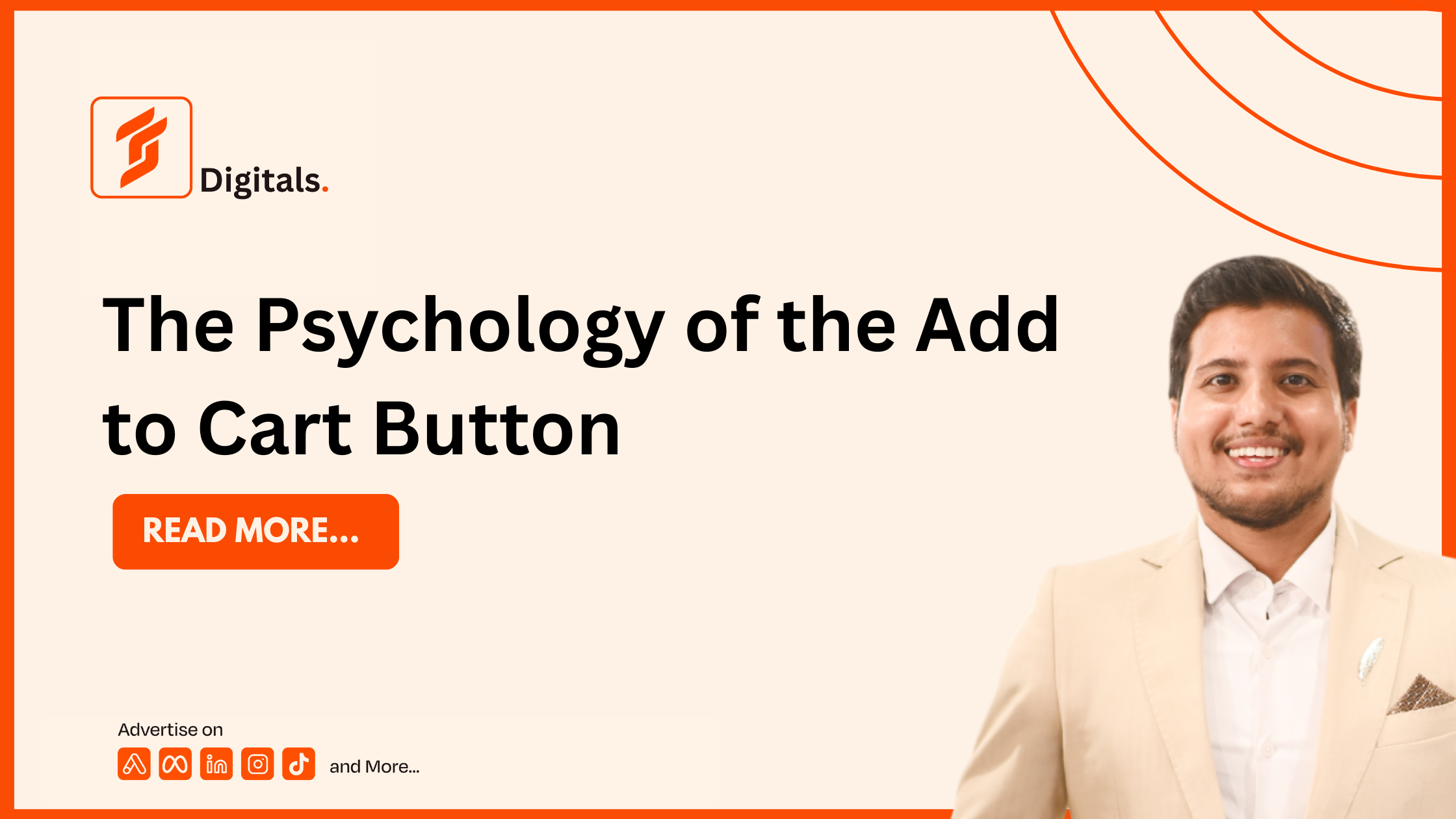
The Psychology of the Add to Cart Button
Introduction
The Add to Cart button may seem like a small element on an ecommerce website, but it plays a major role in influencing purchase decisions. Every click represents a customer moving one step closer to becoming a buyer. The colour, wording, placement, and surrounding design all affect whether a visitor continues shopping or leaves the site.
Successful ecommerce brands understand that increasing conversions is not about luck. It is about understanding customer psychology and removing friction from the buying process. At Farooq Shafi Digitals, we help businesses optimise every stage of the customer journey through Creative Strategy, Branding, Copywriting, Funnels, Conversion Rate Optimization, Paid Ads, Post Production, and Media Buying.
Why the Add to Cart Button Matters
The Add to Cart button is one of the most important calls to action on any ecommerce website. A well designed button encourages action, while a poorly designed one can reduce conversions even if the product is excellent.
Its purpose is simple:
- Guide users toward the next step
- Reduce hesitation
- Increase purchase intent
- Improve conversion rates
The Psychology Behind Customer Decisions
People rarely make buying decisions based on logic alone. Emotions, trust, and perceived value often influence the final action.
Clarity Creates Confidence
Customers should immediately understand what happens after clicking the button.
Simple phrases such as:
- Add to Cart
- Buy Now
- Get Yours Today
perform better than vague or confusing text.
Colour and Contrast
The button should stand out from the rest of the page without distracting the visitor. Strong contrast makes the call to action easier to find and encourages more clicks.
Position Matters
Place the Add to Cart button close to product images, pricing, and key benefits so customers have all the information they need before taking action.
Reduce Decision Fatigue
Too many options create hesitation. A clean product page with one primary call to action helps customers focus on completing the purchase.
Trust Increases Clicks
Customers are more likely to click Add to Cart when they trust the business.
Build trust by including:
- Customer reviews
- Product ratings
- Secure payment badges
- Clear return policies
- Fast shipping information
- Money back guarantees
Common Mistakes That Reduce Conversions
| Mistake | Impact | Better Approach |
|---|---|---|
| Small button | Low visibility | Use a prominent button |
| Confusing text | Lower engagement | Use clear action words |
| Poor contrast | Missed clicks | Improve colour visibility |
| Too many distractions | Decision fatigue | Keep the page simple |
| Missing trust signals | Lower confidence | Add reviews and guarantees |
Optimising the Entire Customer Journey
The Add to Cart button is only one part of the buying experience. Higher conversions require a complete strategy that includes:
Fast Website Speed
A slow website increases abandonment rates.
Persuasive Copywriting
Explain product benefits clearly and focus on customer needs.
Mobile Optimisation
Most online shoppers browse and purchase on mobile devices.
Conversion Rate Optimization
Test different button colours, wording, layouts, and page designs to discover what delivers the best results.
How Farooq Shafi Digitals Helps Ecommerce Brands Grow
Farooq Shafi Digitals combines data driven marketing with customer psychology to help businesses increase conversions and revenue.
Our services include:
- Creative Strategy
- Branding
- Copywriting
- Sales Funnels
- Conversion Rate Optimization
- Paid Advertising
- Media Buying
- Post Production
Our proven performance:
| Performance Metric | Results |
|---|---|
| Total Ad Budget Managed | $7.2 Million |
| Revenue Generated | $68.55 Million |
| Average ROAS | 5x |
Discover how we help businesses grow at www.farooqshafi.com.
Best Practices for High Converting Add to Cart Buttons
Keep the Message Clear
Use simple action focused wording.
Make the Button Stand Out
Use strong visual contrast while maintaining your brand identity.
Build Trust Nearby
Display reviews, guarantees, and secure payment information close to the button.
Test Regularly
A/B testing different designs and messages can significantly improve conversion rates.